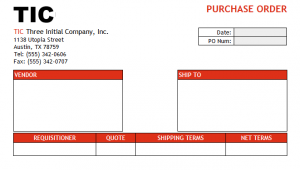
Users who wish to create visually appealing Vtiger email templates often experience frustration as they attempt to apply styling to their templates. This is especially true of common business documents that use complex grid layouts, such as Purchase Orders. The WYSIWYG editor available in stock Vtiger is a fine tool but often simply falls short of what is needed to make professional-looking templates. Experienced web designers will go straight to the template’s source code, but still be frustrated by the lack of external style sheets. While the built-in editor does allow you a limited range of pre-set styles, you don’t get to roll your own! Pasting in HTML from other sources will often fail because nobody uses styles inside HTML tags anymore. Here’s a couple of tips on creating nice email layouts:
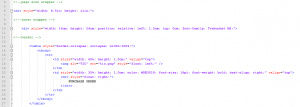
Start with the WYSIWYG editor of your choice, but skip the styling. Just do the basic tables and text to start with. Then, open the HTML code in your favorite text editor and start adding your styles to the tags the old-fashioned way.
Fixed positioning and floating of page elements like DIV tags can be very difficult. Instead, I like to set a DIV envelope with fixed width (8.5 x 11 inches for the example PO), then use simple tables with as few rows and columns as possible with widths set by percentage. Then I use margin styles to set the vertical distance between tables. This helps avoid a lot of finicky adjustment of COLSPAN and ROWSPAN width and height.
This makes for very heavy, hard-to-read code that will not get you an “A” in HTML class. However, you may save yourself hours of frustration and while your hand-crafted code may be ugly, the rendered HTML will beat the built-in editor every time. As an alternative, contact us here at Boru and let us do the heavy lifting for you! We will be delighted to put our experience to work polishing your email templates and raising the tone of your routine communications.


