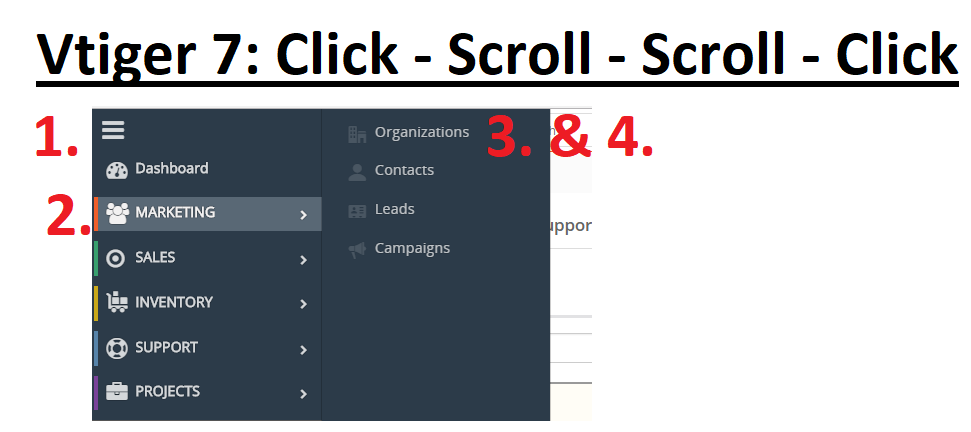
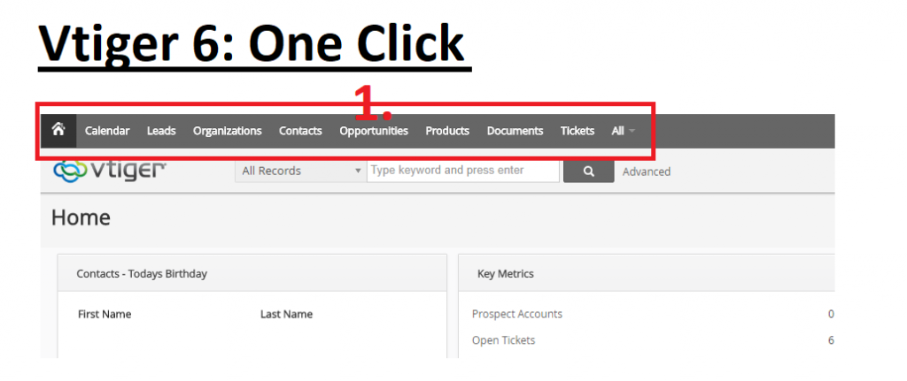
Users now have more steps to get to their desired location from the Vtiger 7 global navigation. While the navigation is more stylized than Vtiger 6.5, you have to click twice and scroll twice to get to the same location.
Take the “Organizations” page location as an example. Only one step is required to go to the “Organizations” page in Vtiger 6, but four steps are required in Vtiger 7:
- Click the three line symbol in the left-hand corner
- Scroll your mouse over the “Marketing” category
- Scroll your mouse over to “Organizations”
- And click on “Organizations”
This is not a great feature and we are talking with Vtiger to see what can be changed. What are your thoughts about the global navigation in Vtiger 7?
If you agree that it is not the best, keep your eye out for our future posts about ways to workaround it.


Contact us to learn more or for help with your Vtiger database!
[button color=”custom” size=”default” light=”no” icon=”fa-comments” open_in_new_window=”yes” link=”https://www.boruapps.com/contact-us/ “]Contact Us[/button]


