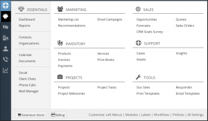
Vtiger 7 (as viewed currently in Vtiger On Demand) has a new Menu button that, when clicked, shows you all the nav options in one screen. It does not seem that big a deal, but they must had a lot of requests for it because they are touting it on social media etc. It’s not a bad feature, I just don’t think it matches the hype.
The more significant change is the Vtiger 7 standard nav menus. They give quick access with in a menu group, but I like the 6.x nav better. I will miss the ability to customize the one click choices on the global nav. They are adding clicks which I think is a move backward.
Here is a screen shot of the new menu pop up


