
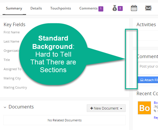
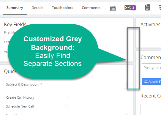
Without a clear distinction of color between the background and features on the Vtiger 7 user interface, it is hard to find different sections quickly. We created a grey background for a client and this improved the visibility of their module records. Now, they can easily navigate their CRM features with the new design.
Clearer Sections – See the Difference:
Contact us to learn more or for help with your Vtiger CRM!
[button color=”custom” size=”default” light=”no” icon=”fa-comments” open_in_new_window=”yes” link=”https://www.boruapps.com/


