Vtiger On Demand has a new user interface with key improvements. Although VTOD users are probably aware of the new features, we want to keep Vtiger Open Source users up to date with On Demand improvements. Improvements in VTOD usually become features in Vtiger open source in the future (possibly within a year).
Three Key Improvements:
1. New Global Navigation that only requires two clicks compared to click-scroll-scroll-click in Open Source
- “Essentials” Category with Vtiger users most useful modules on Left-Hand side
- Similar categories to Vtiger 7 open source, but you can view every category and sub-category with one click instead of the four steps it takes to get to a subcategory in Vtiger Open Source (we wrote about it here)

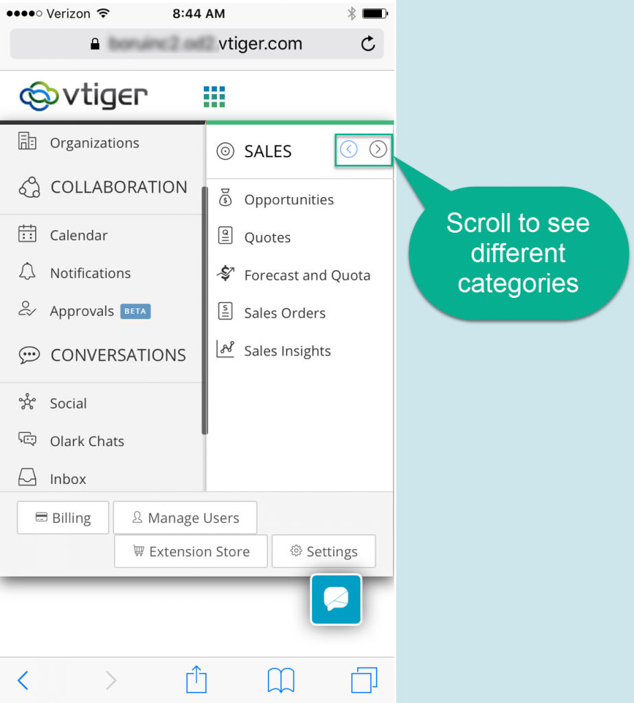
2. Fully Responsive Navigation in VTOD
- Stationary “Essentials” category on left-hand side of the screen
- Left and right arrows to make global navigation fit the screen properly and still give access to all the categories and subcategories
- This addresses a pretty large usability bug in Vtiger Open Source so hopefully, it will be put in open source soon! You cannot access the subcategories in the open source global navigation (we wrote about it here)

3. Different Module View Options – List View, Kanban View, Calendar View

- New Kanban View – shows the process of the record from left to right

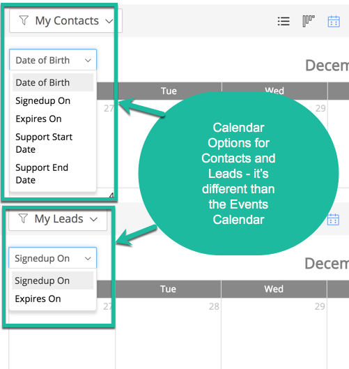
- Calendar View
- Different than the Events Calendar
- Put dates on the calendar that are related to that module- Example: Module=Contacts so Date=Date of Birth

Contact us to learn more or for help with your Vtiger CRM!
[button color=”custom” size=”default” light=”no” icon=”fa-comments” open_in_new_window=”yes” link=”https://www.boruapps.com/


